Document concepts
- Documents and Subdocuments
- Import content from other languages
- Applying styles
- Modifying styles
- Pages and line breaks, Sections
- Include images
- Include bookmarks and hyperlinks
- Fields and Table of Content
- Tables
- About Measures
Documents and Subdocuments
Keyword 'document'
A document means a Word “docx” file that will be generated by pxDoc. You can declare one or several document(s) in any template. But the most common case is that you will have only one document in the root template of your Generator.
document <attributes> { ... }
|
Attributes |
Description |
Possible values (if any) |
Optional |
fileName: "filename.docx" |
Specify the name for the generated document. This attribute is mandatory only when several documents are declared in a single generator |
Any valid file name. Path not allowed here: it will be specified in the generation launching wizard. |
No |
properties: prop1="propValue", prop2=true, ... |
A comma separated list of properties affectations. |
Any property defined in the stylesheet (if the generator is dedicated to a specific stylesheet), or any new property name and values that will be stored as custom properties in the generated document. |
Yes |
attachedTemplate: "path/to/file" |
Path to a Word template, that may include macros, … Path must be accessible by all user opening the document, the macros are not embedded in it. |
Any docx, docm, dotm file. |
Yes |
Usage : Set variables and properties or the document
You can set several variables and properties for a document, each one being separated with a comma:
							document properties:creator="Thom Johnson", revision=1 variables:variableName="My variable value", var2="\\To06\Projects\ModelDocs\"
							{
							  // document content
							}
Document properties (Word standard and custom from your stylesheet) can be suggested with [CTRL]+[SPACE].
Usage : Define a filename and a template for the document
When several documents are generated, you need to specify a filename for each document. You can also specify the path to an existing document containing some macros to be used in the generated document. Below, we define two documents and one of them has a template with macros:
							pxDocGenerator MyGenerator stylesheet:MyStyleSheet {
							  root template main(Object model) {

							    document fileName:"c:\myDoc1.docx" {
							      "This is a simple document"
							    }

							    document
							      attachedTemplate: "templateWithMacros.dotm"
							      fileName:"c:\myDocWithMacros.docx" {

							      "This is another document, which will provide some macros from the template"
							    }
							  }
							}
About Sub-Documents and manual parts
You can specify slave Word documents (also called sub-documents) into the master document being generated.
With pxDoc, you can use it in two different ways:
- Basic reference to an existing external document
- Creation of a "manual part" in your document (more details below)
Focus on manual parts:
Manual parts are sections that will not be erased when you re-generate the document. They are managed through subdocuments.
The first time the document is generated, subdocuments are created (in the same directory or wherever you want). At the next generations, pxDoc will detect that these subdocuments already exist and will not change them.
Keyword 'subDocument'
subDocument <attributes>
|
Attributes |
Description |
Possible values (if any) |
Optional |
subDocument "path/to/subdoc.docx" |
The first parameter is the relative or absolute path of the file to include. |
Any valid file name expressed in relative or absolute. |
No |
fromTemplate: "templates/file.docx" |
Path to the Word document used to initialize the manual part, when they do not already exist. |
Path to an existing Word document. |
Yes |
Usage : Link to an existing subdocument
With an absolute path:
subDocument "\\MyComputer\MyDocuments\mySubDoc.docx"
Or relative to the generated document:
subDocument "MyDocuments/mySubDoc.docx"
Usage : Define manual parts in an iterative way
You can create manual parts iteratively: here, in the context of an impact analysis on some applications, we want to insert comments and results for each application based on the template “templateImpactAnalysis.doc”.
The subdocuments are created in the subdirectory “ImpactAnalysis” of the generated document locationand have the application name in their filename.
The following code will be inserted in a loop (for each application...):
							var String filename = "ImpactAnalysis\Impact Analysis of " + appli.name + ".docx"
							subDocument filename fromTemplate: "templates/templateImpactAnalysis.docx"
Import content from other languages
Keyword 'language'
The language keyword is used to automatically transform a content from a given structured external language (HTML, wiki...) into the pxDoc language.
Today, two renderers are provided with pxDoc: HTML and pxDoc source code. With time, we will integrate more converters.
You can extend an existing language renderer. You can also develop your own renderer. Refer to the dedicated section pxDoc Extensibility/Develop your own language renderer to get more details.
Do not hesitate to share you language renderers or extensions on our Community site!
language [<lang-id>|class:<lang-id>] extension:ext "expression-to-parse"
|
Attributes |
Description |
Possible values (if any) |
Optional |
<lang-id> |
Name of a language supported by an installed language renderer. |
Any language name supported by a language renderer. Today, 'html' and 'pxdoc' are supported out-of-the-box. Not used if class: is specified. |
No |
class:<lang-id> |
Name of a language supported by an installed language renderer and provided as a String by a variable, function... |
Anything providing a language name as a String (variable, function...). Not used if <lang-id> is specified (hard-coded). |
No |
|
<expression_to_parse> |
A string expressed in a specific language. |
No |
|
extension:<ext> |
Take into account an extension of for the specified language renderer |
Any java instance implementing IPxDocRendererExtension as an extension for the language renderer |
Yes |
Usage : Include html content in several ways
							var anHtmlExpression = myApi.getHtmlDocumentation()
							language html anHtmlExpression
							var languageType="html"
							language class:languageType anHtmlExpression
							language html
							  "<ul>
							    <li>item1</li>
							    <li>item2</li>
							   </ul>"
Usage : Use an extension of the HTML renderer
Refer to the documentation describing the generic Generators
Applying styles
What we call styles are the Styles you can define in Word:
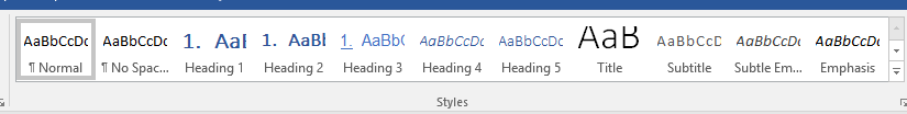
You can directly apply these styles to the content of your document (see Keyword #, below).
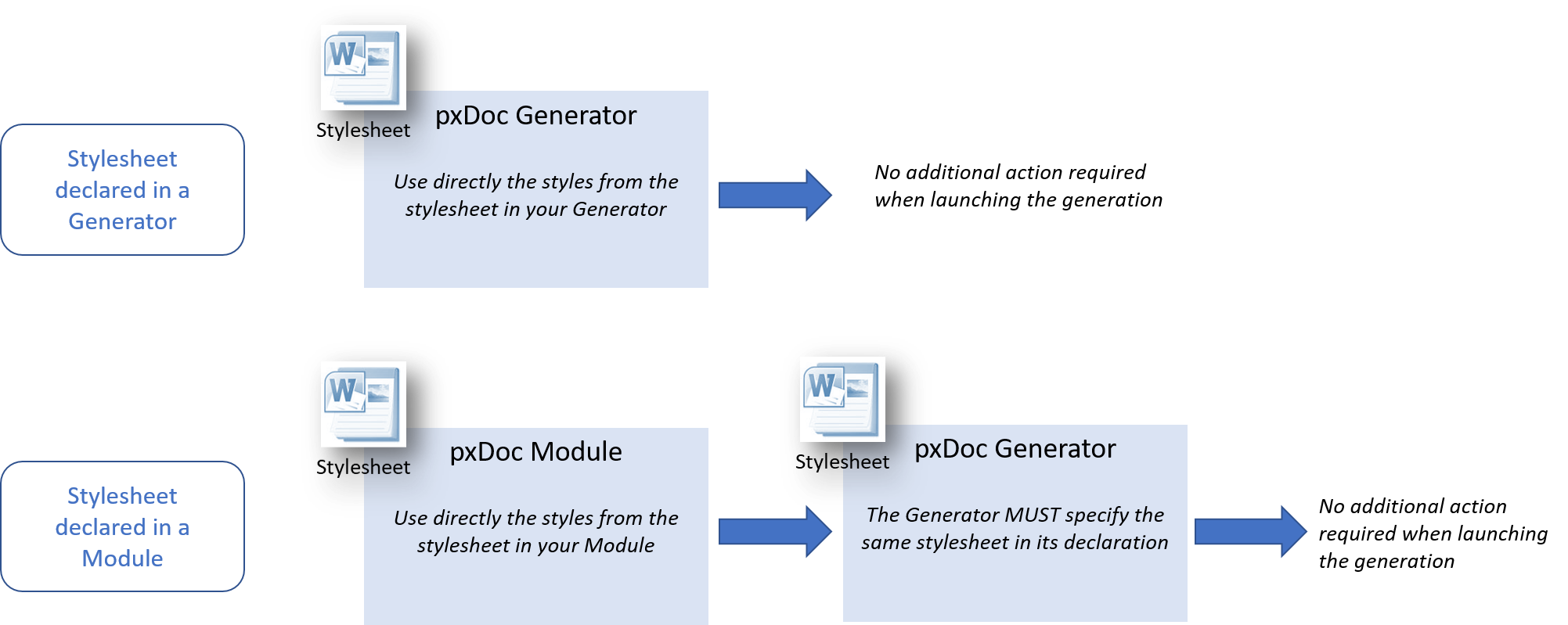
There are 2 ways to declare styles in a Generator or a Module: get styles directly from a stylesheet, or define “variable styles”.
Get Styles from a stylesheet
This is the easiest and most efficient way for simple generators: you get the styles from a Word Stylesheet (.dotx) that is referenced in your pxDoc project when creating it.
The stylesheet is specified when creating the project and it can:
- be located in an existing project in your workspace
- copied from an external location into your project: they are then referenced as an extension in the plugin.xml file of your project.
pxDocGenerator MyGenerator stylesheet:MyStylesheet {...}
Same with a Module:
pxDocModule MyModule stylesheet:MyStylesheet {...}
If you use a stylesheet in a Module, you will need to use the same stylesheet in your Generator. So, the most generic/reusable way is to define variable styles in your Modules
Use variable styles
Variable style are style-names defined directly in the generator. These styles do not have any formatting characteristics: they will be bound with a stylesheet in the end.
- Variable styles from a Generator will be bound manually with the styles of a stylesheet when launching the document generation
- Variable styles from a Module will be bound in the Generators:
- Either with the Styles from the stylesheet declared in the Generator
- Or with the variable styles declared in the Generator
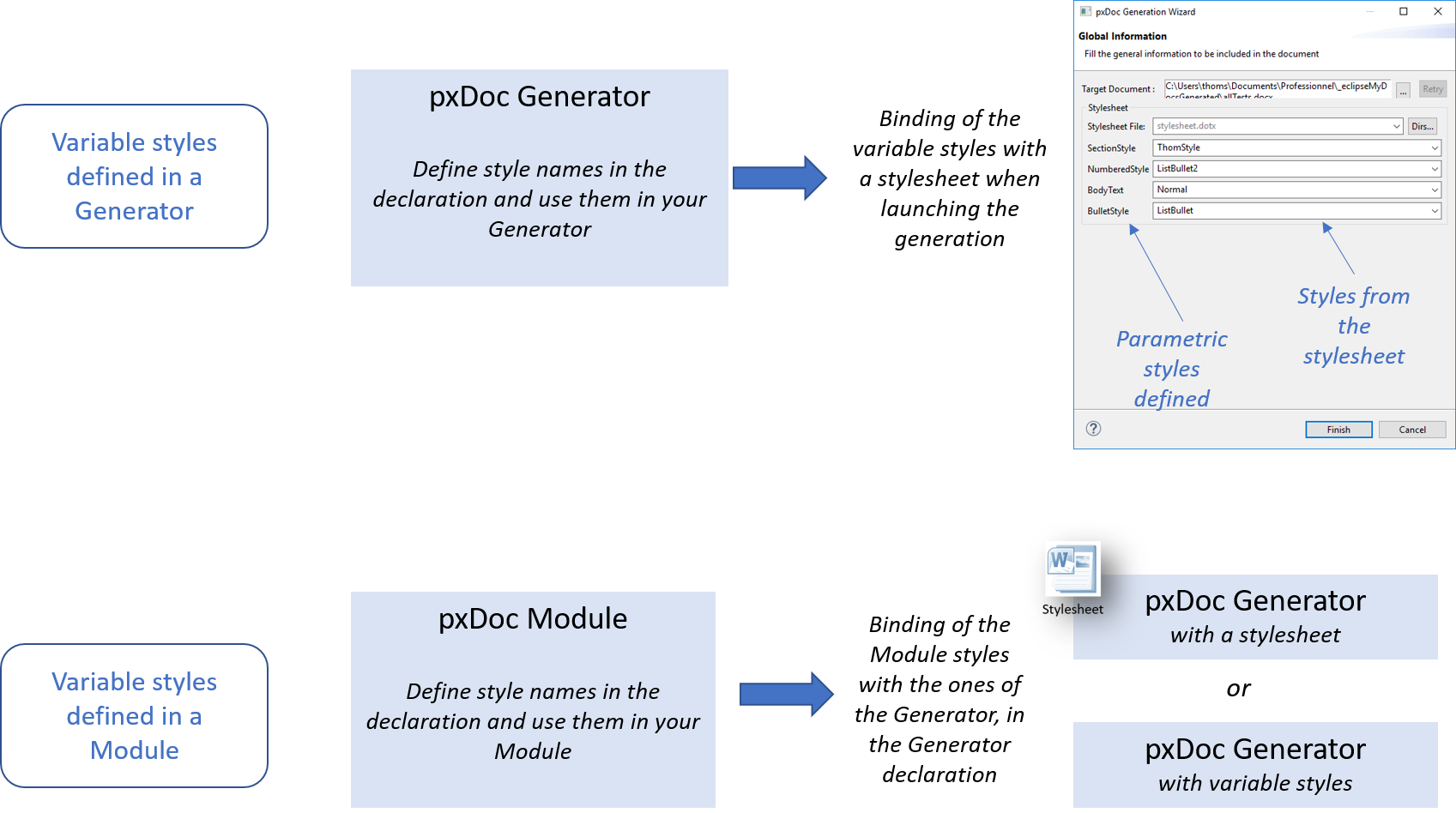
To define variable styles, use the attributes styles: when declaring a Module or a Generator to declare the style-names.
Usage : Use variable styles in a Module
A Module is created with the styles myTitle1, myTitle2:
pxDocModule TestModule styles: myTitle1, myTitle2
When declaring a Generator using this module, you map these styles with the ones of the Generator (here, from a stylesheet):
					pxDocGenerator TestGenerator
					  with: TestModule
					  stylesheet:"stylesheet.dotx"
					  styleBindings: myTitle1->Heading1, myTitle2->Heading2 {
					  ...
					}
Keyword 'styleApplication'
To apply a style to a content, just use the hash '#' before the style-name:
						#Heading1 {"My Title 1"}
						#Normal {"My content in Normal"}
You can use the suggestions [CTRL]+[SPACE] from Eclipse to see the available styles from the stylesheet or from the list of variable styles.
pxDoc detects only styles not tagged as hidden by MS Word. Sometimes, Word automatically marks some styles as hidden because they are not used.
To ensure a style is not hidden, you just need to write some dummy text using this style in the stylesheet. This dummy text will not appear in the generated document
|
Attributes |
Description |
Possible values (if any) |
Optional |
align: <left|...> |
Set the paragraph alignment |
both, centered, left, right |
Yes |
keepWithNext |
Keep this paragraph with the next (avoid page break). |
Yes |
|
numbering (level:<int>) |
Apply a numeric list to the style |
Level: integer between 1 and 6 |
Yes |
bullet (level:<int>) |
Apply a bullet list to the style |
Level: integer between 1 and 6 |
Yes |
shift: <Measure> |
Set an indentation for the paragraph |
refer to About Measures section |
Yes |
Usage : Apply a Style
You can directly write text:
#Heading2 {"The Style Heading2" }
Or get content from a function:
#Normal {"This the class: " class.getName() }
Usage : Specify attributes to the style
							#Normal align:center {"You can specify the alignment" }
							#Heading2 shift:2cm {"You can also specify the indent of the text"}
Keyword 'HeadingN'
You can use the HeadingN keyword to apply heading styles (from level 1 to 9), which are particular Styles in Word.
HeadingN level:<int>
|
Attributes |
Description |
Possible values (if any) |
Optional |
level: <int> |
Set the title level |
Integer between 1 and 9 |
No |
keepWithNext |
Keep this paragraph with the next (avoid page break). |
Yes |
Usage : Use HeadingN in a recursive algorithm to get the accurate title level
HeadingN is particularly useful when creating different levels of title in your algorithms.
For example, below, we want to generate a description of nested packages:
							template pkgDocumentation(Package pkg, int titleLevel) {
							  HeadingN level:titleLevel {pkg.name}

							  ... /* documentation of this package */

							  for (subPkg : pkg.nestedPackages) {
							    // We apply recursively the current template to the nested packages,
							    // increasing the Heading level (e.g. subtitles) with each level of nested packages
							    apply pkgDocumentation(subPkg, titleLevel+1)
							  }
							}
We have defined a template for a package description, which contain:
- A package and a titleLevel as argument
- A title of level ‘titleLevel’ showing the package name
- A description of this package
- A loop to call to the same template for the nested packages for which the title will be at level titleLevel+1
In the generator, we just need to apply the template to the top-level package:
							var Package myPackage = ...
							apply pkgDocumentation(myPackage, 1)
Modifying styles
Obvious keywords have been defined to apply basic style modifiers to your text:
- Unitary modifiers: keywords bold, italic, underline, color,...
- Keyword font to directly apply several modifiers
These styling are applied to a block and can be nested.
Keyword 'bold'
Apply bold style to the bloc
bold {...}
Keyword 'italic'
Apply italic style to the bloc
italic {...}
Keyword 'underline'
Apply underline style to the bloc
underline type:<single|dash|...> {'underlined'}
|
Attributes |
Description |
Possible values (if any) |
Optional |
type:<single|dash|...> |
The type of underline |
single, dash, dashDotDotHeavy, dashDotHeavy, dashedHeavy, dashLong, dashLongHeavy, dotDash, dotDotDash, dotted, dottedHeavy, double, thick, wave, wavyDouble, wavyHeavy, word |
Yes |
Keyword 'strike'
Apply strike style to the bloc
strike type:<single|DOUBLE> {'striked text'}
|
Attributes |
Description |
Possible values (if any) |
Optional |
type:<single|DOUBLE> |
The type of strike |
single, DOUBLE |
Yes |
Keyword 'subscript'
Apply subscript style to the bloc
subscript {...}
Keyword 'superscript'
Apply superscript style to the bloc
superscript {...}
Keyword 'color'
Apply a color to the bloc
Use [CTRL]-[SPACE] to pick up a color directly in a pop-up window!
color "R,G,B" {...}
|
Attributes |
Description |
Possible values (if any) |
Optional |
"R,G,B" |
The RGB value as a comma separated string |
R, G and B are integers between 0 and 255. |
No |
Keyword 'font'
You can use the keyword font to set the font name and size, the background color and strike/underline type
font <attributes> {...}
|
Attributes |
Description |
Possible values (if any) |
Optional |
name: fontName |
Name of the font to be applied |
Any font name that is available in the stylesheet With variable styles, no restriction (no stylesheet to parse available fonts) |
Yes |
size: fontSize size: 12 |
Size of the font in points |
integer |
Yes |
bold |
Set the font to bold |
Yes |
|
italic |
Set the font to italic |
Yes |
|
subscript |
Set the font to subscript |
Yes |
|
superscript |
Set the font to superscript |
Yes |
|
underline ( type: <single|...> ) |
Set the font underlined |
Yes |
|
strike ( type:<single|...> ) |
Set the font striked |
Yes |
|
color: "R,G,B" |
Set the font color |
R, G and B are integers between 0 and 255. |
Yes |
backgroundColor: "R,G,B" |
Set the font background color |
R, G and B are integers between 0 and 255. |
Yes |
Usages
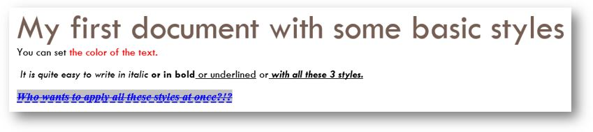
Usage : Use Styles and basic style modifiers
					#Title {"My first document with some basic styles" }
					  #Normal {
					    "You can set"
					    color "255,0,0" {" the color of the text." }
					    italic {" It is quite easy to write in italic" }
					    bold {" or in bold" }
					    underline {" or underlined" }
					    " or"
					    bold {
					      italic {
					        underline {
					          " with all these 3 styles."
					        }
					      }
					    }
					  }
					  #Normal {
					    font name: "Times New Roman" size:12 color: "0,0,255"
					      backgroundColor: "192,192,192" bold italic underline strike(SINGLE)
					    {
					      "Who wants to apply all these styles at once?!?"
					    }
					  }
With our Stylesheet from the tutorial, you will get this:
Pages and line breaks, Sections
Keyword 'paragraphBreak'
Insert a paragraph break.
§
Keyword 'newLine'
Insert a line break.
newLine
Keyword 'nextColumn'
Insert a column break, e.g. go to the next column in a section with multiple columns. (see section below)
nextColumn
Keyword 'newPage'
Insert a page break
newPage
Keyword 'section'
Define a new section in the document.
section <attributes>
|
Attributes |
Description |
Possible values (if any) |
Optional |
type: <continuous|...> |
Define the type of the section |
continuous evenPage oddPage nextPage |
Yes |
landscape |
Change to landscape orientation (incl. page break, of course) |
When omitted, a section is considered as Portrait per default |
Yes |
column: <int> |
Define the number of columns in the section |
Any integer |
Yes |
columnsSpace: <measure> |
Define the empty space between 2 columns |
refer to About Measures section |
Yes |
Breaks usages
Usage : Try all section types and breaks
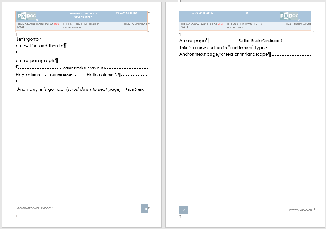
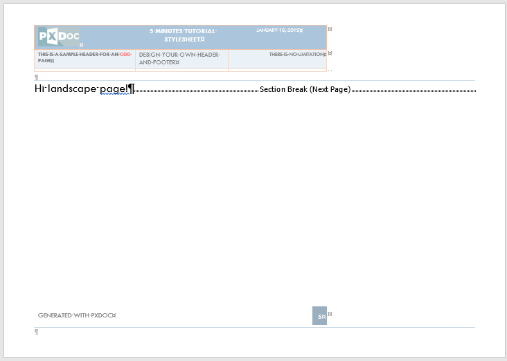
					"Let's go to"
					newLine
					"a new line and then to"
					§
					"a new paragraph."
					§
					§
					section columns:2 type: continuous
					"Hey column 1"
					nextColumn
					"Hello column 2"
					section columns:1 type: continuous
					§
					§
					" And now, let's go to... "newPage
					"A new page"
					section type:continuous // per default, this means Portrait
					"This is a new section in continuous type."
					newLine
					"And on next page, a section in landscape"
					section landscape
					"Hi landscape page!"
					section
Keyword 'samePage'
The samePage instruction aims to keep its content in the same document page. This is particularly useful when inserting a set of images that need to be kept on the same page.
Warning
SamePage is more an 'experimental' function that may not work properly 100% of time (e.g. when there is a long text to display in the block).
But it is a useful function in most cases!
						samePage {
						  HeadingN level:2 {"Illustration " }
						  #Normal {"The images below are too big for the page, but it has been automatically resized by pxDoc!" }
						  image path:"images/too_big.png"
						}
As pxDoc generate native docx file, without 'using' Microsoft Word itself, it cannot know the height of the header and footer when generating the document: these heights depend on the content of the headers and footers defined in your stylesheet or template.
To solve this concern, you need to provide those values to pxDoc, using the headerHeight and footerHeight attributes when deploying a new stylesheet. You can modify these values in the plugin.xml file in the project where the stylesheet was first deployed.
Include images
Keyword 'image'
Insert an image:
- Either from an existing file
- Or from a java.awt.Image object
image <attributes>
|
Attributes |
Description |
Possible values (if any) |
Optional |
path: imagePath |
Define the location of the image. The path can be local to your project or a URL/path on your PC/network/internet. |
Cannot be used with the 'java:' attribute |
No |
java: imageObject |
Insert an image with a java object |
Any java.awt.Image. Cannot be used with the 'path:' attribute |
No |
width: <measure> |
Specify the width of the image |
refer to About Measures section |
Yes |
height: <measure> |
Specify the height of the image |
refer to About Measures section |
Yes |
hPosition ( align: <left|...> relativeFrom: <page|...> ) |
Set the horizontal position of the image |
align: left, right, center relativeFrom: character, column, page, margin, insideMargin, outsideMargin, leftMargin, rightMargin |
Yes |
vPosition ( align: <top|...> relativeFrom: <page|...> ) |
Set the vertical position of the image |
align: bottom, top, center, inside, outside relativeFrom: line, page, margin, insideMargin, outsideMargin |
Yes |
Usages of image
Usage : Image embedded in your project
image path:"images/an_image.png"
If an image is too big for the page (height or width), pxDoc automatically resize it.
					image path:"images/an_image.png" width:100pixels
					image path:"images/an_image.png" width:5cm
You can specify only the height (or width) of the image,pxDoc automatically calculate the width (or height) to keep the aspect ratio.
Usage : Image on your computer
An image on your computer which takes 50% of the available height.
image path:"C:/images/myImage.png" height:50pc
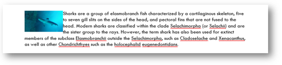
Usage : Image in line with the text, at the top left of the paragraph
You can specify the position of the image
					#Normal{
					  image path:"images/aquarium1.jpg" width:3cm  hPosition(align:left relativeFrom:margin) vPosition(align:top relativeFrom:paragraph)
					  "Sharks are a group of elasmobranch fish characterized by a cartilaginous skeleton, five to seven gill slits on the sides of the head, and pectoral fins that are not fused to the head. Modern sharks are classified within the clade Selachimorpha (or Selachii) and are the sister group to the rays. However, the term ""shark"" has also been used for extinct members of the subclass Elasmobranchii outside the Selachimorpha, such as Cladoselache and Xenacanthus, as well as other Chondrichthyes such as the holocephalid eugenedontidans."
					}
You get the following result:
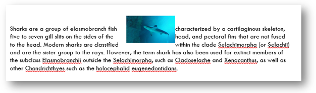
Usage : Image horizontally and vertically centered
Changing the positioning to:
- Horizontal: centered relatively from the margins
- Vertical: centered relatively to the line:
					#Normal{
					  image path:"images/aquarium1.jpg" width:3cm  hPosition(align:center relativeFrom:margin) vPosition(align:center relativeFrom:line)
					  "Sharks are a group of elasmobranch fish characterized by a cartilaginous skeleton, five to seven gill slits on the sides of the head, and pectoral fins that are not fused to the head. Modern sharks are classified within the clade Selachimorpha (or Selachii) and are the sister group to the rays. However, the term ""shark"" has also been used for extinct members of the subclass Elasmobranchii outside the Selachimorpha, such as Cladoselache and Xenacanthus, as well as other Chondrichthyes such as the holocephalid eugenedontidans."
					}
You get the following result:
Include bookmarks and hyperlinks
Keyword 'bookmark'
A bookmark has a name (ID) and is applied to a block of text.
bookmark <id> {...}
|
Attributes |
Description |
Possible values (if any) |
Optional |
|
<id> |
The bookmark id. Once defined, hyperlinks can target bookmarks in your document. |
Any bookmark value that is accepted by the Word standard: must start with an alphabetic character, should not exceed 40 characters, no special characters allowed. |
No |
Usage : Define a bookmark
							HeadingN level:1 {bookmark "intro" {"Introduction"}}

							bookmark getBookmarkId(myObject) { myObject.name }
Keyword 'hyperlink'
Hyperlink is used to insert a link to a bookmark or to a location outside the document. It is applied to a block of text (text to display) and may contain a comment.
hyperlink <attributes> {...}
|
Attributes |
Description |
Possible values (if any) |
Optional |
bookmark: "<bookmarkID>" |
Insert a link to a bookmark in the document Not used if an hyperlink is specified |
Any valid bookmark ID |
No |
href: "URL" |
Insert a link to a web page, a folder or a filet Not used if a bookmark is specified |
Any valid path or URL (URL must begin with “http(s)://” |
No |
comment: "a comment" |
Alt text, displayed when flying over the link |
Yes |
Usage : Link to a bookmark in the document
Link to the bookmark “intro” with a display text:
hyperlink bookmark:"intro" {"Go back to the introduction"}
Usage : Link to a web site
Link to a website with a given display text and a tooltip when flying over the link:
hyperlink href:"http://www.pxdoc.fr" comment:"pxDoc is really cool!" {italic {"A link to our website" }}
Fields and Table of Content
Keyword 'toc'
To insert a simple table of content use the keyword toc.
You can add a title and parameters for the table of contents.
toc <attributes>
|
Attributes |
Description |
Possible values (if any) |
Optional |
title: "title" |
A title of the TOC |
Any string |
Yes |
titleStyle: styleName |
Apply a style to the title |
An existing style (variable or explicit) |
Yes |
parameters: "parameters-expression" |
Specify advanced parameters for the TOC |
See the OOXML specification for managed parameters. |
Yes |
Usage : TOC with a title and showing only the headings from level 1 to 3
Insert a TOC with the title “This is the Table of Content” (on which the style Heading1 is applied).
The parameter \o “1-3” means that the TOC will present the headings from level 1 to 3 only.
toc title:"This is the Table of Content" titleStyle:Heading1 parameters:'\o "1-3" '
Keyword 'field'
You can insert Word fields in your document, use the keyword field.
field <FIELDNAME> <attributes>
|
Attributes |
Description |
Possible values (if any) |
Optional |
<ADDRESSBLOCK|...> |
Name of the field to insert. |
ADDRESSBLOCK, ADVANCE, ASK, AUTHOR, AUTOTEXT, AUTOTEXTLIST, BIBLIOGRAPHY, CITATION, COMMENTS, COMPARE, CREATEDATE, DATABASE, DATE, DOCPROPERTY, DOCVARIABLE, EDITTIME, FILENAME, FILESIZE, FILLIN, FORMCHECKBOX, FORMDROPDOWN, FORMTEXT, GOTOBUTTON, GREETINGLINE, HYPERLINK, IF, INCLUDEPICTURE, INCLUDETEXT, INDEX, KEYWORDS, LASTSAVEDBY, LINK, LISTNUM, MACROBUTTON, MERGEFIELD, MERGEREC, MERGESEQ, NEXT, NEXTIF, NOTEREF, NUMCHARS, NUMPAGES, NUMWORDS, PAGE, PAGEREF, PRINT, PRINTDATE, PRIVATE, QUOTE, RD, REF, REVNUM, SAVEDATE, SECTION, SECTIONPAGES, SEQ, SET, SKIPIF, STYLEREF, SUBJECT, SYMBOL, TA, TC, TEMPLATE, TIME, TITLE, TOA, TOC, USERADDRESS, USERINITIALS, USERNAME, XE |
No |
parameters: "parameters-expression" |
Parameters expression suited to the selected field. |
See OOXML specification. |
Yes |
display: "pretty-text" |
Text to display until field is refreshed in Word |
Any string |
Yes |
Usage : Insert the page number
field PAGE
Usage : Insert the name of the author of the document
Insert the field AUTHOR, give the value “Thomas S” to the property of the document, display the name in upper case:
field AUTHOR parameters:' "Thomas S" \* Upper'
Another way to show the name of the author with a text to display until the field is refreshed:
field DOCPROPERTY parameters:"Author" display:"Refresh field to display the Author name"
Tables
Principles
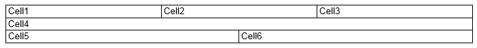
the pxDoc language is designed to simplify the generation of tables inside documents. At its most simple expression a table can be specified with:
					table {
					  row {
					    cell {"Cell1" }
					    cell {"Cell2" }
					    cell {"Cell3" }
					  }
					  row {
					    cell {"Cell4" }
					  }
					  row {
					    cell {"Cell5" }
					    cell {"Cell6" }
					  }
					}
Without any explicit indications, pxdDoc will infer table dimensions: the table width is set to the page available width, and each cell share the available width with its siblings in the row.
And the result will be:
Properties can be injected into the table at several levels:
					table <global-properties> [ <column-1-properties> | <column-2-properties> | ... ] {

					  row <global-properties> [ <column-1-properties> | <column-2-properties> | ... ] {

					    cell [ <cell-1-properties> ] { "Cell Content" }
					    cell [ <cell-2-properties> ] { "Cell Content" }
					  }
					}
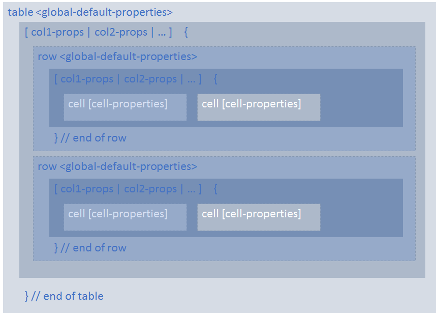
- global table properties will be applied by default to every cell, except if superseded at row or cell level.
- column properties expressed at table level will be applied by default to column child cells, except if superseeded at row or cell level.
- global row properties will be applied by default to every cell in the row, except if superseded at row column properties level or cell level.
- row column properties will be applied accordingly to row cells, except if superseded at cell level.
- cell properties can override any inherited properties from row or table level
Keyword 'table'
						table <attributes> [ <col1-props> | <col2-props> | ... ] {
						  //definition of rows
						}
|
Attributes |
Description |
Possible values (if any) |
Optional |
width: <measure> |
Width of the table. |
refer to About Measures section |
Yes |
left: <measure> |
Insert a left margin for the table. |
refer to About Measures section |
Yes |
shadingColor: "R,G,B" |
Set a shading color for the entire table. |
RGB comma separated value. |
Yes |
shadingPattern: <solid|...> |
The shading pattern to apply. |
Use suggestion [CTRL]-[SPACE] to see all available patterns |
Yes |
borders ( size: <int> type:<single|...> color:"R,G,B" ) |
Set border properties for all borders (bottom, top, left, right) of all the cells of table. |
- size: allows to set the size of the all borders in twips - type: allows to set the kind of borders - color: allows to set the color of the borders |
Yes |
[ <col1-props> | <col2-props> | ... ] |
Set table columns properties. See next section for details. |
Yes |
Keyword 'columnProperties'
Column attributes can be defined at table and row levels, with override principle (cell attributes overriding any table, row or column attributes).
They are defined between square brackets, with a vertical bar as a separator between columns:
[ <col1-properties> | <col2-properties> | ...]
|
Attributes |
Description |
Possible values (if any) |
Optional |
width: <measure> |
Set the column width. |
refer to About Measures section |
Yes |
vAlign: <bottom|...> |
Set the vertical alignment of the content of cells |
bottom, center, top |
Yes |
shadingColor: "R,G,B" |
Set a shading color for the column. |
RGB comma separated value. |
Yes |
shadingPattern:<solid|...> |
The shading pattern to apply to the column. |
Use suggestion [CTRL]-[SPACE] to see all available patterns |
Yes |
merge:<start|...> |
Set merge behavior for column's cells. |
- none: no merge, or stop merge - start: starts merging cells - proceed: continue to merge cells - automatic: this option analyzes cell contents and merge cells having the same content. This is the simplest option to merge cells, but it is sometimes necessary to control the merging process using the basic none, start and proceed values. |
Yes |
bottomBorder ( size: <int> type:<single|...> color:"R,G,B" ) |
Set a bottom border for column's cells. Bottom border properties can be specified to manage the border size, type and color. |
- size: allows to set the size of the border in twips - type: allows to set the kind of border - color: allows to set the color of the border |
Yes |
topBorder ( size: <int> type:<single|...> color:"R,G,B" ) |
Set a top border for column's cells. Top border properties can be specified to manage the border size, type and color. |
- size: allows to set the size of the border in twips - type: allows to set the kind of border - color: allows to set the color of the border |
Yes |
leftBorder ( size: <int> type:<single|...> color:"R,G,B" ) |
Set a left border for column's cells. Left border properties can be specified to manage the border size, type and color. |
- size: allows to set the size of the border in twips - type: allows to set the kind of border - color: allows to set the color of the border |
Yes |
rightBorder( size:<int> type:<single | dash | ...> color:"R,G,B") |
Set a right border for column's cells. Right border properties can be specified to manage the border size, type and color. |
- size: allows to set the size of the border in twips - type: allows to set the kind of border - color: allows to set the color of the border |
Yes |
borders ( size: <int> type:<single|...> color:"R,G,B" ) |
Set all border properties (bottom, top, left, right) for column's cells. |
- size: allows to set the size of the all borders in twips - type: allows to set the kind of borders - color: allows to set the color of the borders |
Yes |
Keyword 'row'
Specify a row in a table.
						row <attributes> [<col1>|<col2>|...] {
						  //definition of cells
						}
|
Attributes |
Description |
Possible values (if any) |
Optional |
header |
Specify the current row is a header row. It is useful for some functionalities (repeat header row at each page…) |
Yes |
|
cantSplit |
Specify that the row cannot be displayed on 2 different pages |
Yes |
|
height: <measure> |
Specify the height of the row |
refer to About Measures section |
Yes |
shadingColor: "R,G,B" |
Set a shading color for the entire row. |
RGB comma separated value. |
Yes |
shadingPattern: <solid|...> |
The shading pattern to apply. |
Use suggestion [CTRL]-[SPACE] to see all available patterns |
Yes |
borders ( size: <int> type:<single|...> color:"R,G,B" ) |
Set border properties (bottom, top, left, right) for row's cells. |
- size: allows to set the size of the all borders in twips - type: allows to set the kind of borders - color: allows to set the color of the borders |
Yes |
[ <col1-props> | <col2-props> | ... ] |
Set row's columns properties |
Refer to the columnProperties section |
Yes |
Keyword 'cell'
Defines a cell in a row.
|
Attributes |
Description |
Possible values (if any) |
Optional |
[ <cell-props> ] |
Set the cell properties. |
Same as the columnProperties . |
Yes |
Usages
Usage : A table with automatic merge
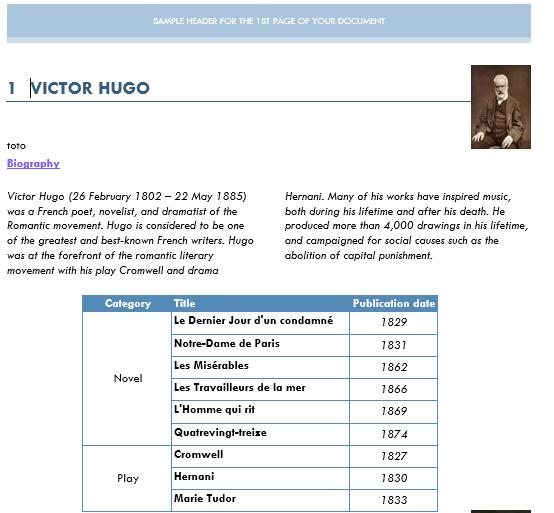
Let’s look at the example shown on the homepage of our website. The purpose is to create a table with a bibliography of some authors with some cells merged in the Category column.
Example for Victor Hugo:
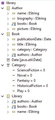
This example is based on the following metamodel:
In this example, we simply used the merge:automatic attribute: pxDoc will automatically merge the cells when it detects that the books have the same categories:
					table left:2.5cm borders(size:8 type:single color:"84,138,183"  ) [ width:20pc | width:40pc | width:20pc ] {

					  // Definition of the heading row
					   row {
					        cell {"Category"}
					        cell {"Title"}
					        cell {"Publication date"}
					    }
					    for (book : author.books.sortBy[category]) {
					        row {
					            cell [merge:automatic] {book.category}
					            cell {book.title}
					            cell {book.publicationDate}
					        }
					    }
					}
About Measures
You can express measures in several unities available in Word.
- Centimeters: cm
- Pixels: pixel
- Twips (twentieth of a point): twips
- Percentage: pc (100% corresponds to the whole available width or height of the page)